

PostUp
Turning whiteboards into a workspace app where freelancers find desks fast
PROJECT
ROLE
GV Redesign Sprint For A Mobile App
Sole UX/UI Designer - Research, Concept, Flows, Wireframes, Prototyping, Testing
TIMELINE
5 Days
TOOLS
Design & Prototyping: Marvel, Miro
Research & Documentation: Notion, Google Docs, Google Slides
Collaboration & Communication: Zoom, Google Meet
INTRODUCTION
This case study presents PostUp, a solution designed to help freelancers find public workspaces that truly fit their needs—reliable Wi-Fi, outlets, quiet areas, and privacy—features often missing from general tools like Google Maps or Yelp. To address this gap, I ran a condensed 5-day GV Design Sprint to quickly ideate, design, and prototype a tailored app experience. Through user research, I identified freelancers’ key requirements and drew inspiration from platforms like Airbnb, Google Maps, and Yelp to design an intuitive workspace-finding tool with detailed filters, user reviews, and an interactive map. As the sole designer, I led the research synthesis, concept development, and prototyping, validating the experience through usability testing. The final solution directly supports freelancers’ needs and provides a scalable foundation for future development.
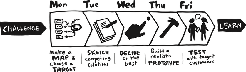
DAY 1 - MAPPING
PROBLEM
Many freelancers struggle to find “good” public places where to do work outside of their home. Searching for appropriate locations is time consuming and often results in less-than-desirable outcomes when the location found fails the freelancer’s hopes, needs, or expectations.
SUMMARY OF RESEARCH INSIGHTS

Freelancers lack a tool designed specifically to help them find suitable places to work while on the go. They rely on Google or Yelp, using reviews to gauge potential work spots—especially in unfamiliar areas. Most users look for locations with available seating, low noise levels, and enough privacy for calls or client meetings. Essential amenities include
reliable Wi-Fi, outlets, restrooms, and adequate space to set up a comfortable workstation, with good coffee or food as added perks. While freelancers prefer not to overspend, they’re willing to make a purchase to access these amenities without feeling unwelcome.
MAP OF POSSIBLE END-TO-END USER EXPERIENCE


DAY 2 - SKETCHING
LIGHTNING DEMOS
To prepare for the Lightning Demos, I researched apps that could inspire features for PostUp. Airbnb was my first reference point—an app I use often and admire for its filter options, interactive map, and rating system. These elements aligned well with the needs of PostUp’s users. I then looked for apps with strong community, map-based, or review-driven components. I explored several coworking apps mentioned in online articles and in the App Store (e.g., Workform, Work Hard Anywhere, Virtlo, Nomad Life), but most were outdated, buggy, or lacked meaningful functionality. Ultimately, I focused on three well-established apps for inspiration:
.png)
These apps provided proven design patterns that helped shape PostUp’s search, comparison, and feedback features.


SELECTING THE MOST CRITICAL SCREEN
I identified the “Select a Place” screen as the most critical moment in the PostUp user journey. This is where users narrow their options and ultimately decide which location to visit. Once they make that choice, the most challenging part—finding the right place—is already done. The remaining step is simply going there. Because this screen brings together all the user’s research and decision-making, it serves as the key point of conversion from interest to action.
CRAZY 8S
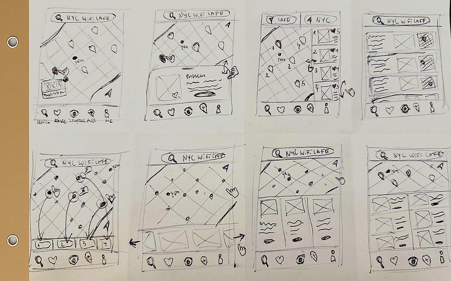
SOLUTION SKETCH

DAY 3 - DECIDING
PROCESS
To create an intuitive flow, I built on familiar patterns from apps like Google Maps, Airbnb, and Yelp, enhancing them with added clarity and decision support. Instead of dropping users directly into the map, the experience begins with simple choices—geographic area and place type—to establish context. The interactive map then appears with collapsible results, allowing users to focus by tapping into a single location’s details. To support confident decision-making, I introduced a shortlist feature, enabling users to compare up to three locations side-by-side before selecting one. After choosing a place, users receive directions, can check in upon arrival, and are prompted to leave feedback when checking out. This structured flow blends familiarity with guided decision-making, offering a clear, focused, and engaging workspace-finding experience. Below is the 15-panel storyboard illustrating this process.
15-PANEL STORYBOARD

DAY 4 - PROTOTYPING
This prototype focuses on delivering a guided and streamlined workspace-finding experience for freelancers. Rather than overwhelming users with a map at the start, it introduces a structured search flow that reflects familiar digital behaviors and reduces cognitive load. The design emphasizes clarity, progressive disclosure, and decision support—supporting exploration, comparison, and confident selection based on user priorities. Inspired by familiar patterns, the experience smoothly transitions from search to selection, and eventually to real-world usage, with check-in, check-out, and feedback prompts that help generate valuable crowd-sourced insights.
The above process helped refine decision-making touchpoints and reduce friction across the user journey. For sprint efficiency, I built the below 15-screen mid-fidelity wireframes and prototype using Marvel.
MID-FI WIREFRAMES
.png)
The mid-fidelity wireframes were linked into an interactive prototype to simulate real user interactions and validate the flow.
EXPLORE THE INTERACTIVE PROTOTYPE

DAY 5 - TESTING
The goal of user testing was to evaluate whether users understood the dual-search flow, could efficiently compare workspace options, and felt supported in making confident decisions. I also observed engagement with check-in/check-out and feedback features to gauge motivation, clarity, and perceived value. Overall, testing focused on validating usability, familiarity, and satisfaction while assessing whether the experience felt purposeful and intuitive.
To gather these insights, I recruited a focused group of users who closely matched the target audience and conducted moderated remote testing sessions. The overview below summarizes the participant profile and testing setup.
PARTICIPANTS & RECRUITMENT

INTERVIEWING & TESTING EXPERIENCE

SUMMARY OF INTERVIEW FINDINGS
User testing revealed valuable insights across five key areas—navigation, search behavior, feature comprehension, and feedback engagement. While the app felt familiar, clean, and intuitive, users highlighted several opportunities to improve clarity, timing, and visual guidance.

1
Navigation & Icon Clarity
Users found the flow intuitive but wanted clearer "back" options and more familiar icons to reduce hesitation, especially for features like compare and check-in.
2
Search & Filters
Preferences varied—some wanted detailed filters upfront while others preferred a simpler start, suggesting filters should be introduced progressively.
3
Map Interaction & Visual Hierarchy
The map felt familiar, but users wanted clearer differentiation (e.g., current location vs. results) and more visually organized information like distance or ratings.
4
Feature Awareness & Understanding
Features like comparison, check-in, and exit surveys were seen as valuable but needed clearer context, timing, and purpose to feel meaningful.
5
Feedback & Motivation
Users were more likely to leave reviews when prompted with simple tools like sliders or star ratings, especially when tied to real attributes such as Wi-Fi or noise.
CONCLUSION
Through this design sprint, I concluded that PostUp would be most impactful as a feature integrated into an existing platform rather than a standalone subscription-based app. This approach removes adoption barriers, leverages an established user base, and positions PostUp as a value-adding enhancement rather than an additional commitment. With that in mind, I focused the prototype on core functionality instead of payment flows, prioritizing a clear, intuitive experience that demonstrates how PostUp could seamlessly support users within a larger ecosystem. Usability testing reinforced this direction, revealing opportunities to refine navigation, streamline search and filters, strengthen map interactions, and clarify feedback mechanisms—all essential to shaping PostUp into a simple, supportive, and engaging tool for freelancers on the go.

LESSONS LEARNED
Clarity Beats Complexity
Users rely on clear navigation, recognizable icons, and simple search flows to stay oriented and confident
Context Matters
Delivering filters, comparisons, and feedback prompts at the right moment reduces cognitive load and improves engagement.
Visual Hierarchy Drives Decisions
Photos, ratings, labels, and clear markers meaningfully impact how users scan and choose locations.
Motivation Requires Framing
Users are more willing to participate (e.g., surveys, check-ins) when they understand how it benefits them and the community.