
VELOZONE
Optimizing a premium bike shop for clean UX and smooth buyer flow
PROJECT
ROLE
TIMELINE
E-Commerce Website Experience Upgrade
Solo UX/UI Designer - Research, Product Design, Content Strategy, Wireframing, Prototyping
4 Weeks
TOOLS
Design & Prototyping: Figma, Miro, Canva, Keynote, Unsplash
Research & Documentation: Xtensio, Google Docs, Google Slides
Collaboration & Communication: Zoom, Google Meet, Facetime, Viber, WhatsApp
.png)
INTRODUCTION
OVERVIEW
VeloZone is a premium e-commerce platform specializing in high-performance bicycles. While it attracts a loyal, affluent audience, the shopping experience was not meeting user expectations. As the sole UX/UI designer, I took on a four-week project to deliver measurable impact by applying research, thoughtful design, and iterative testing.
The condensed timeline required meticulous planning, rapid decision-making, and a reliance on user feedback to guide key choices. I combined competitor analysis, secondary research, and usability testing to create solutions tailored to VeloZone’s detail-oriented, high-income audience. This case study highlights my end-to-end process, from identifying user pain points to validating refined solutions through testing.


.png)
.png)
.png)
PROBLEM, OBJECTIVE, & GOALS
Despite its strong brand appeal, VeloZone faced major drop-offs in the sales funnel. Users struggled with product discovery and comparison, and nearly 70% abandoned their carts during checkout. To address these challenges, my objective was to redesign the shopping experience so it felt more intuitive, engaging, and seamless, while staying aligned with both user needs and business priorities. From this, three clear goals emerged:

1
Product Discovery
Improve navigation and filtering to make finding products easier.
2
Decision Making
Help users compare products confidently and decide with ease.
3
Checkout Process
Streamline checkout to reduce cart abandonment.
Ultimately, this project demonstrates how design thinking can resolve complex e-commerce challenges and strengthen both user experience and business performance.
DISCOVERY
UNDERSTANDING USER NEEDS & PAIN POINTS
VeloZone caters to a niche audience of high-income, detail-oriented cycling enthusiasts who value advanced technology and premium quality. These users engage deeply with product pages, rely on comparison tools, and conduct extensive research before making a purchase. To capture their needs, I developed the key user persona of “Jack Speed – The Performance Enthusiast,” which guided the design toward building trust, simplifying decision-making, and reinforcing VeloZone’s position as a leader in high-end cycling.
The Performance Enthusiast
Age: 34
Gender: Male
Income: $180,000/year
Occupation: Financial Analyst
Location: Suburban area with easy access to trails and cycling paths
Jack Speed
PAIN POINTS
-
Frustrated by lack of clarity when comparing tech specs
-
Wants a seamless checkout experience that saves time
LIFESTYLE
-
Serious cyclist with a passion for road and endurance biking
-
Participates in races and cycling events regularly
MOTIVATIONS
-
Looking for high-performance bikes and gear to enhance performance
-
Values precision, quality, and innovation in cycling products

BEHAVIORS
-
Spends hours researching bikes and reading expert reviews before purchasing
-
Frequently browses mobile sites but completes transactions on a desktop
-
Values detailed specs, personalized recommendations, and advanced filters
NEEDS
-
Advanced search and filtering options for bike types and components
-
Technical comparison tools to evaluate bikes based on performance metrics
-
Guest checkout option to simplify online purchases
Aligning this user understanding with the earlier identified project goals—enhancing product discovery, optimizing comparison tools, and streamlining the checkout process—I uncovered specific pain points and opportunities for improvement. These included the need for advanced filters and well-organized categories to simplify browsing, clear card-based layouts to make comparisons effortless, and a more efficient checkout flow with guest options, fewer steps, and stronger trust signals.
RESEARCH METHODOLOGY & SYNTHESIS
To validate and refine these insights, I employed a combination of research methodologies - secondary research, competitive analysis, and usability testing.
SECONDARY
RESEARCH
COMPETITIVE ANALYSIS
LO-FI DESIGNS
HI-FI DESIGNS
-
E-commerce case studies and usability reports - Baymard Institute, Nielsen Norman Group, and Think with Google.
-
Desktop & mobile platforms of e-commerce competitors:
-
Indirect - Amazon and Target
-
Direct - Trek Bikes, Canyon Bikes, REI, Decathlon, Competitive Cyclist
-
USABILITY TESTING
-
2 rounds x 5 participants, each (amateur & professional cyclists)
The research and synthesis provided a solid foundation, highlighting where the shopping experience fell short and how it could be improved. Building on these insights, I entered the design and validation phase, focusing on transforming findings into practical, user-centered solutions tested in real scenarios.
DESIGN & VALIDATION
APPROACH & CONSTRAINTS
Designs were informed by research insights and competitive analysis, with findings translated into user flows and refined through two rounds of user testing. Low-fidelity wireframes were iteratively developed into high-fidelity prototypes, while constraints included a tight four-week timeline, the need to serve both novice and expert users, and the challenge of preventing feature overload while maintaining a premium, user-friendly brand experience.
DESIGN FOUNDATIONS
The design process began with establishing a strong foundation through information architecture and user flows. Building on insights from the discovery phase, I translated research findings into clear, actionable flows that addressed VeloZone’s three central challenges:

1
Product Discovery
Navigation, filtering, and recommendation tools were enhanced to help users find relevant products more quickly and easily.
2
Decision Making
Comparison tools were designed to simplify evaluations, ease decision burden, and build user confidence in purchase choices.
3
Checkout Process
The checkout flow was streamlined to reduce cart abandonment by simplifying steps and clarifying both guest and member pathways.
By mapping the end-to-end user journey in this structured way, I was able to identify opportunities to minimize friction and design intuitive interactions that worked for both novice and experienced users. To keep the flows coherent and visually accessible, I organized them into the two main groups shown below.
Discovery & Comparison Flows
.png)
.png)
Checkout (Guest & Member) Flow
As these flows evolved into higher-fidelity prototypes, the style guide was expanded and refined to reinforce VeloZone’s premium brand identity while keeping usability at the forefront. A carefully balanced color palette was introduced, with Burnt Orange (#FF6A28) drawing attention to primary CTAs, Cool White (#F4F4F4) opening up clean spaces, and neutrals like Steel Gray (#6E6E6E) and Gunmetal Gray (#4A4A4A) providing hierarchy and subtlety for secondary elements. Typography choices supported both impact and clarity: Bebas Neue for strong, recognizable headlines and Open Sans for navigation and body copy. This integration of structure and visual language created a cohesive foundation-functional, intuitive, and aligned with VeloZone's high-end branding.
.png)
ITERATION PROCESS
Building on the initial research insights, I began developing low-fidelity wireframes and wireflows that emphasized usability and simplicity while targeting the platform’s most critical pain points. These early designs served as a foundation for iterative usability testing, ensuring that the proposed solutions aligned with user expectations before advancing to higher-fidelity stages.
The first round of usability testing centered on these low-fidelity prototypes. Five participants drawn from VeloZone’s target demographic—each representing a range of cycling experience levels—were invited to evaluate the designs. The objective was to uncover friction points and identify opportunities for improvement across the platform’s core functions, including product discovery, filtering, comparison, and checkout. Insights from this stage were systematically integrated into the next phase of design development.
In the second round of usability testing, I introduced a high-fidelity prototype that incorporated refinements based on the first round’s feedback. The same participant group returned to assess the improved designs, allowing for a direct comparison of experiences across iterations. This approach not only validated whether previously identified pain points had been effectively resolved but also confirmed that the evolving design direction aligned with both novice and advanced user needs.
1
Product Discovery
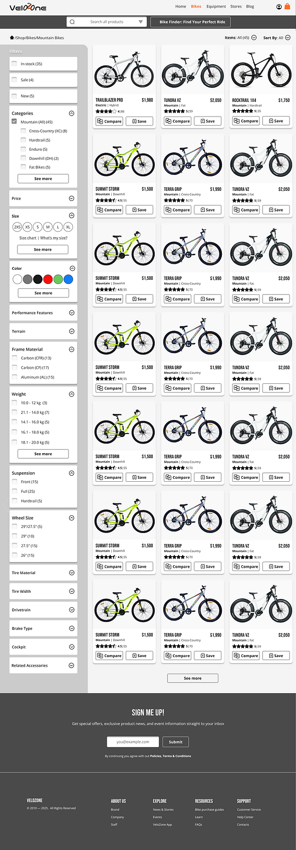
LO-FI PAGE: FILTERING
-
Filters lacked options for advanced needs such as terrain type, temperature adaptability, or endurance.
-
Participants suggested prioritizing “price” over “size” and deprioritizing “color.”

HI-FI PAGE: FILTERING
-
Displaying bike categories on product cards saved users time and improved clarity.
-
Advanced users appreciated the new filters for terrain adaptability and performance.
LO-FI PAGE: RECOMMENDATION TOOL
-
Users made selections using small radio buttons, making the interaction feel like a form rather than product exploration.
-
Terrain options appeared uniform with minimal indication of selection, forcing users to rely on small icons for feedback.

HI-FI PAGE: RECOMMENDATION TOOL
-
Large, clickable image cards replaced radio buttons, creating a more intuitive, visually guided interaction.
-
The selected option now features a clear highlight and arrow CTA, giving instant feedback and smoother navigation.

2
Decision Making
LO-FI PAGE: COMPARISON TOOL
-
“Shop Bike” buttons were positioned below the comparison table, forcing users to scroll down after reviewing details.
-
Product cards were simple boxes with minimal hierarchy, making it harder to distinguish key information (name, price, rating).
-
Users had to manually add products, making comparison slow and click-heavy.
HI-FI PAGE: COMPARISON TOOL
-
The “Shop Bike” CTA is now anchored directly under each product card at the top of the comparison view.
-
Cards use clear visual hierarchy, which front-loads essential info, letting users evaluate and act without extra scrolling or reading.
-
A “Suggest for me” button auto-fills the rack, streamlining comparison and reducing effort.


LO-FI PAGE: PRODUCT DETAILS
-
Reviews were pushed far down the page making them less noticeable and less persuasive at the point of decision.
-
Product description was visually dense, crowded, and harder to digest.
HI-FI PAGE: PRODUCT DETAILS
-
Reviews are placed closer to key product details, boosting scannability and buyer confidence at decision time.
-
Improved whitespace enhances visual hierarchy, making key info easier to scan and process quickly.
.png)

3
Checkout Process
LO-FI PAGE: CART
HI-FI PAGE: CART
-
The top section felt cramped with size, color, and product text tightly packed together, making it harder to scan.
-
Users requested a summary of selected features before completing purchases.
-
Improved spacing and grouping make the description clearer and easier to scan.
-
The new, expandable review summary highlights key strengths, speeding up confident decisions.

.png)
LO-FI PAGE: CHECKOUT
HI-FI PAGE: CHECKOUT
-
The sign-up form required multiple fields, making the process feel lengthy and discouraging quick sign-in.
-
"Guest" and "Member" tabs were less visually distinct, making it easy to overlook the preferred path.
-
The radio buttons for third-party sign-up options were small and easy to miss, making alternative sign-in paths less intuitive.
-
Fewer fields and clearer sign-in options made member login faster and easier.
-
More prominent tabs help users quickly choose their checkout path.
-
Replacing radio buttons with CTAs improves clarity, visibility, and speed.


FINAL PROTOTYPE
By incorporating user flows at the beginning and embedding the style guide during the transition to high-fidelity designs, I created a design system that prioritized both usability and branding. The iterative process—from lo-fi wireframes to validated hi-fi prototypes—ensured that every design decision was aligned with user needs, resulting in an intuitive platform that met both VeloZone’s business goals and its audience’s expectations.
EXPLORE THE INTERACTIVE PROTOTYPE
.png)
CONCLUSION
Through two iterative testing rounds, I refined VeloZone’s platform to better meet user needs. The final design delivers a seamless shopping experience that balances simplicity for beginners with advanced functionality for experienced cyclists. Key improvements include an optimized filtering system, a more intuitive comparison tool, and a streamlined checkout flow that builds trust and reduces friction. By integrating user feedback throughout the process, the prototype aligns with VeloZone’s premium brand identity and positions it as a user-focused e-commerce leader.

LESSONS LEARNED
User Feedback Is Essential
Early usability testing revealed key friction points that shaped critical design decisions.
Simplicity Drives Engagement
Reducing steps and visual clutter created a smoother, more approachable experience for all user levels.
Flexibility Matters
Balancing beginner-friendly navigation with advanced options ensured broader appeal.
Continuing Iteration Strengthens The Product
Each testing round not only validated improvements but also uncovered new opportunities for refinement.