
COMPLEAT PLAN
Designing a wellness app where mindful living meets intuitive design
PROJECT
ROLE
A Mobile App From Concept To Prototype
Sole UX/UI Designer - Research, Product Strategy, Design-Thinking, Interaction Design, Prototyping
TIMELINE
8 Weeks
TOOLS
Design & Prototyping: Figma, Miro, Canva, Keynote, Unsplash
Research & Documentation: Xtensio, Google Docs, Google Slides
Collaboration & Communication: Zoom, Google Meet, Facetime, Viber, WhatsApp


INTRODUCTION
OVERVIEW
Over 25 years ago, I made a personal commitment to transform my health—a decision that ultimately shaped the course of my career. That journey led me to pursue a PhD in nutrition and dedicate myself to helping others achieve sustainable wellness. Through years of coaching, I witnessed firsthand just how challenging lasting behavior change can be, especially for people balancing work, family, and other responsibilities. This experience inspired the concept for a wellness app designed to make science-based guidance in nutrition, fitness, and behavior change more accessible, personalized, and sustainable for everyday users. I selected this idea as the focus of my first UX/UI capstone project at Springboard, approaching it with both professional expertise and a foundation of rigorous research.
PROBLEM, OBJECTIVE, & GOALS
The core challenge was clear: how can healthy living be made more accessible and sustainable for busy individuals? To explore this question, I drew from my background in nutrition and fitness and conducted extensive secondary research using credible academic and industry sources—including Google Scholar, Statista, Pew Research Center, JSTOR, Project MUSE, PubMed, Medline, and ProQuest—to better understand the broader wellness landscape.


The insights closely aligned with what I’d seen in practice. While people are deeply motivated to improve their health, maintaining new habits is difficult. Daily demands, time constraints, confusing and conflicting information, and fragmented wellness tools all contribute to this struggle. Lack of time consistently emerged as the primary barrier. And although health apps offer promise, the current market is oversaturated and often overwhelming. Many platforms address only one dimension of wellness, which leads to decision fatigue and inconsistent engagement.
It became clear that an effective solution must simplify the wellness journey, remove unnecessary friction, and support holistic, sustainable behavior change. These insights shaped the following project goals:

1
Simplify The Wellness Experience
Simplify healthy living through a clear, intuitive experience.
2
Reduce Decision Fatigue
Reduce decision fatigue by guiding users toward personalized, actionable steps.
3
Integrate Wellness Holistically
Integrate wellness holistically, supporting sustainable, long-term habits.
DISCOVERY
DEFINING THE AUDIENCE
Building on insights from both secondary research and my professional experience, I defined my target audience as busy, wellness-minded individuals who are either already engaged in wellness activities or planning to begin. Many had prior experience with wellness apps but struggled with time constraints, inconsistent habits, and difficulty maintaining motivation over time.
PRIMARY RESEARCH METHODOLOGY
I recruited participants through a mix of social media platforms (Facebook, Instagram, LinkedIn, Slack) and personal networks (friends, family, clients). A short screening survey helped identify individuals who matched the target profile. Out of 17 respondents, I selected five participants (three women and two men) for 30–45 minute in-depth, semi-structured interviews via Zoom. These sessions balanced open-ended storytelling with structured prompts., providing rich insight into participants’ real experiences with wellness routines and apps, revealing their motivations, pain points, and behavioral patterns.
SYNTHESIS
To analyze the collected qualitative data, I began with affinity mapping, clustering similar behaviors, frustrations, and desires into clear categories, sub-categories, and themes. This revealed meaningful patterns that guided subsequent design decisions. I then used empathy mapping, breaking each theme into “Saying,” “Thinking,” “Doing,” and “Feeling” categories to uncover both rational and emotional user perspectives. This process created a holistic understanding of users’ wellness journeys and what truly motivates—or hinders—them. The full Affinity and Empathy Maps can be viewed 👉[here & here].
These synthesized insights laid the groundwork for developing two distinct user personas that capture the full spectrum of user needs—from structured tracking to supportive guidance—and clearly informed how the product should adapt to varying levels of experience:
The FITNESS ENTHUSIAST
The FITNESS NOVICE

Senior Manager
Alex Strong
Age: 47
Work: Senior Manager
Family: Partnered, kid-free
Location: Washington, DC
Character: Planner

Freelancer
Mia Torn
Age: 40
Work: Freelancer
Family: Partnered, with kid/s
Location: Sofia, BG
Character: Caregiver
Being healthy enables me to do the things that make me happy, like traveling or hiking.
Being healthy means being balanced, present in the moment, and able to empathize.
Bio
Alex is a healthy, middle-aged professional in the prime of his life. He has been successful at changing his health for the better. He used to struggle with maintaining a healthy weight - lacking physical activity, eating chaotically, and/or drinking too much - but changed course after a health scare. He is determined to stay in control of his health and wellness in order to be able to do the things that make life worth it for him.
Bio
Mia is a busy freelance professional in her early 40s. She has dabbled in health and wellness in the past but those habits didn't stick. She often struggles with motivation and discipline, and is distracted by a hectic work and family schedule. She is overwhelmed by the sheer volume of conflicting wellness advice out there. Mia aspires to live a more balanced life in order to feel more energetic and present in her relationships with others.
Frustrations
-
Too many apps/devices
-
Lack of integration
-
Lack of holistic health overview
-
Lack of credible information
Frustrations
-
Little knowledge or experience with health tech
-
Lack of motivation, discipline, and structure
-
Busy work and family schedule
-
Overwhelming or conflicting wellness information
GOALS
-
Maintain healthy habits
-
Approach wellness holistically
-
Age with grace without pain
-
Enjoy life to the fullest
GOALS
-
Build better health habits holistically
-
Stay focused following a plan
-
Feel more balanced and energetic
-
Be present in relationships with others
TRAITS
TRAITS
TECH SAVVINESS
Multi-device
Uni-device
App addict
App dabbler
Always
Unplugged
TECH SAVVINESS
Multi-device
Uni-device
App addict
App dabbler
Always
Unplugged
Budget
Low
High
Budget
Low
High
PLANNING
Low
High
PLANNING
Low
High
MOTIVATIONS
Incentive
Fear
Control
Achievement
Social
Family
MOTIVATIONS
Incentive
Fear
Control
Achievement
Social
Family
WELLNESS TOOLS
Apps & websites
Tracking devices
Personal training
Medical or expert advice
Social media
WELLNESS TOOLS
Apps & websites
Tracking devices
Personal training
Medical or expert advice
Social media
To deepen this understanding, I conducted a Jobs To Be Done (JTBD) analysis, clarifying the core outcomes each persona seeks. This informed a set of “How Might We” (HMW) questions designed to guide ideation and shape solutions for each user group:

ALEX
-
How might we integrate health & wellness metrics into a single, holistic view?
-
How might we offer flexible tracking to fit busy schedules?
-
How might we deliver personalized, expert feeback?

MIA
-
How might we guide beginners in building simple, balanced routines step-by-step?
-
How might we foster a supportive, motivating community?
-
How might we make expert guidance easy, accessible, and empowering?
Despite their differences, insights across both personas pointed toward an app experience centered on customization, holistic support, habit-building simplicity, and differentiated feedback based on user needs. Building on this, I made a strategic decision to focus the solutions and MVP on the novice wellness seeker—prioritizing simplicity, emotional support, and sustainable habit formation to address the biggest adoption barriers, while laying a scalable foundation for more advanced features tailored to experienced users.
DESIGN
DATA ARCHITECTURE
Before moving into sketching and wireframing, I conducted a quick heuristic analysis of three major competitors—Fitbit, MyFitnessPal, and Cronometer—to ensure the app’s design was grounded in usability best practices. From there, I created a site map and user flows to establish a clear structure and intuitive navigation. The site map offered a high-level view of the app’s main sections and features, ensuring logical organization and seamless connections between them - view 👉 [here]. In parallel, user flows mapped the key paths users would take to complete essential tasks, such as setting wellness goals, viewing plans, or tracking progress (shown below).

Sign Up/Log In Flows
Plan/Progress Flows

LO-FI DESIGNS
Given this foundational work, sketching and wireframing became more focused and effective. I drew initial concepts on paper, then scanned and organized them digitally, visually arranging them along the already defined user flows. A very detailed low-fidelity scheme can be seen 👉[here].
Sign Up/Log In Flows

Plan/Progress Flows

MID-FI DESIGNS
This allowed me to see the sequence of tasks clearly and identify potential gaps or redundancies. In turn, scanned sketches became the blueprint for more refined wireframes and wireflows, translating rough ideas into more precise layouts capturing both primary user paths (red routes) and potential edge cases. A very detailed mid-fidelity scheme can be seen 👉 [here].
Sign Up/Log In Flows (Red Routes)

Sign Up/Log In Flows (Edge Cases)

Plan/Progress Flows (Red Routes & Edge Cases)

VISUAL DESIGN
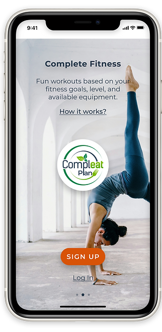
With wireframes, wireflows, and data architecture established, I was ready to shift my focus towards visual design, ensuring my app would not only function smoothly but also resonate aesthetically with users. To build a cohesive visual experience, I first developed a brand identity for the app as an accessible, trustworthy health coach - combining expertise with a disciplined yet supportive approach, and defined by qualities like comprehensiveness, cleverness, generosity, balance, and sustainability. I named the app “ComplEat Plan” to convey a holistic wellness journey, with “eat” underscoring nutrition’s importance and “plan” emphasizing the structure essential for lasting health. This foundation guided the creation of a logo that encapsulated the brand’s essence in a recognizable, memorable symbol. Next, I created a lightweight mood board to capture the visual tone and emotional feel, selecting colors, typography, and imagery that aligned with the brand identity.

From there I established a basic style guide to standardize these elements across the design, detailing everything from color palettes and fonts to button styles and spacing rules. This style guide served as a visual roadmap that ensured consistency and cohesion, while at the same time evolving thoughtfully through design iterations.

HI-FI DESIGNS
Ultimately, I crafted high-fidelity mockups that translated my brand’s vision into a more polished and cohesive interface.
ONBOARDING
.png)
SIGN UP ERROR
.png)
LOG IN ERROR
.png)
PLAN - JOURNAL - PROGRESS

PLAN - JOURNAL - PROGRESS ERROR
.png)
VALIDATION
PROTOTYPING, USABILITY TESTING, & ITERATION
The transition from high-fidelity mockups to a fully interactive prototype involved linking screens to simulate realistic user flows, integrating feedback from earlier design stages, and polishing visual elements to closely resemble a final product. This transformed static mockups into a functional prototype, ready to validate design choices and reveal opportunities for refinement.
For the first round of usability testing, I conducted five 30-minute remote sessions with likely users. Each session included a short briefing, task performance, and a debrief. Observing real-time interactions uncovered one critical issue (an unresponsive back button), several major issues (unclear plan definition, duration, and start dates), and minor issues (progress bar styles, recipe views, and date pickers), alongside a few cosmetic adjustments.
After addressing these issues, I ran a second round of usability testing, conducting 30-minute sessions with five new participants. This time, users experienced fewer difficulties and praised the interface for its clean, uncluttered design and elegant visual style. Text, icons, and imagery were clear and easy to navigate, with no functional errors encountered. Remaining refinements focused on more conceptual improvements, including better emphasizing the app’s “completeness,” adding contextual guidance, and fine-tuning icon labels for clarity.
FINAL PROTOTYPE
The final interactive prototype reflects multiple rounds of iteration and testing, transforming early mockups into a refined, user-centered experience. By addressing critical, major, and minor issues, the design evolved into a clean, intuitive, and cohesive product that users found easy to navigate.
EXPLORE THE INTERACTIVE PROTOTYPE
CONCLUSION
This project was an invaluable opportunity to deepen my understanding of aligning user needs with intuitive, purposeful design. It strengthened my skills in usability, user empathy, and strategic decision-making, while reinforcing how thoughtful UX can drive meaningful behavior change. Looking ahead, I would focus on emphasizing the value of a comprehensive wellness plan, ensuring users clearly understand the app’s unique offerings. I’d also highlight journaling as a core personalization feature, empowering users to adapt the app to their individual goals. Finally, I’d design clear, concise onboarding instructions to guide users smoothly into the app’s core functionality from day one. These steps would enhance both clarity and engagement, setting the stage for even stronger adoption and impact.

LESSONS LEARNED
User-Centered Design Is Essential
Understanding user behaviors and motivations is the foundation of creating meaningful, supportive experiences.
Iteration Drives Stronger Solutions
Continuous testing and refinement improved both usability and conceptual clarity.
Simplicity Builds Trust
Balancing information with intuitive design helped create a supportive, not overwhelming, experience.
Details Matter
Even small design elements—like icon labels or spacing—significantly influence user perception and confidence.